Ed Ruscha’s Streets of Los Angeles (SoLA) Archive is confounding. Attempting to encapsulate and convey what this archive is, what it is about, and what it contains is a considerable challenge because of its immense size and the many contradictions and ironies it embodies. The archive is exhaustive but not comprehensive; it includes incredible local detail but traces a broad swath of time; it is represented through both physical materials (e.g., negatives, notebooks, and pasteups) and a significant number of digital components (e.g., collections data, geospatial data, and digital images). The SoLA Archive is full of information. What this information signifies, however, is not always clear. Yet this lack of clarity can show up in ways that offer interesting insights into the nature of archives, art making, and digital scholarship.
As Beth Ann Guynn, David Newbury, and Lily Pregill detail in their essay, the SoLA Archive required novel approaches to archive processing and digitization.1 It also thwarts conventional research approaches, perhaps more than most archives. The researcher is immediately challenged by the difficulty of transforming information into knowledge, which is not only a practical concern but also, in many ways, the subject of Ruscha’s overall project: How does anyone make sense of information, especially when there is a superabundance of it? What are the systems, digital or otherwise, through which we process information, and in what ways do these systems succeed and fail?
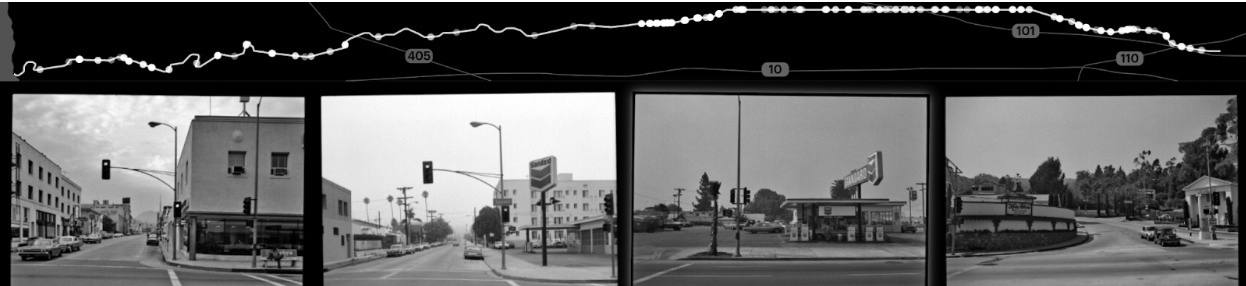
Transforming aspects of the SoLA Archive into data was a critical step in making sense of it and in making the archive findable and browsable so it can serve as a resource for research and knowledge production. This data—that is, the digital images, geospatial information, descriptive tags, and machine-readable versions of the text that appears in the images—was used by Stamen Design to build “12 Sunsets: Exploring Ed Ruscha’s Archive,” a web-based interface that provides a visualization of the twelve digitized shoots of Sunset Boulevard, spanning 1965 to 2007.2 And for this digital publication, data visualization seemed like an effective way to communicate what this archive is and what it encompasses (see “You Are Here: Locating the SoLA Archive,” “Description as Data: What the Tags See in the SoLA Archive,” “Place as Data: What Geolocation Can Tell Us,” and “The Limits of Data: 10 Banks, a Few Rivers, and Some Snow,” this volume).
Put simply, data visualization refers to the practice of creating images to represent information. Charts, graphs, and diagrams are all examples of data visualizations. This concept is, of course, not a new one; maps are one kind of data visualization that humans have been making and using for as long as we have been able to draw. The advent of modern computing has meant the availability of more quantitative information, or data, and a greater variety of tools and formats for representing this data as images.
Using data visualization techniques, we sought to represent a macro view of the SoLA Archive: the time span, what is digitized and what remains as negatives, and the geography covered (and not covered) by the photographs. However, we did not regard data visualization as a tool for capturing any kind of direct or objective truth about the SoLA Archive; nor did we seek to make any definitive arguments about what it contains. Rather, in addition to clarifying what the SoLA Archive is and is not, we deployed data visualization as a critical method and as part of a process of discovery and invention. Like Ruscha’s artistic practice, we used data visualization to measure the distance between image and descriptor, to make sense and nonsense, and to locate and identify the outlier, the mistake, and the unexpected within a mass of information.
Before we turn to specific examples of how data visualization can be deployed as critical practice in relation to the SoLA Archive, there are some caveats to keep in mind. Data visualization is a process with several steps and variables, each of which can affect and shift the outcome. For example, using a dataset of descriptive tags generated for each of the digital images in the SoLA Archive, it is possible to create visualizations based on one such tag: palm tree. By looking at where this tag appears in different shoots across various years, you can track the growth of individual palm trees over time, explore the relation of different palm tree species to demographic trends, and so on. However, some factors will influence the accuracy of the resulting visualizations.
Consider, for example, the two maps from “12 Sunsets” of the 55 images tagged palm tree in the black-and-white shoot of Sunset Boulevard from 1998, and the 361 images tagged palm tree in the color shoot of 2007 (figs. 4.1, 4.2). Either 306 palm trees were planted along Sunset Boulevard between 1998 and 2007 or, more likely, the algorithm used to generate the descriptive tags for these images works significantly better on color images than it does on black and white. Thus, what seems at first like a neutral and fairly well–understood process of image analysis turns out to be highly contingent, subject to limitations, and often a source of surprise. Understanding and working within these contingencies and limitations—in the data, in the processes of analyses and data management, and in the design of the resulting image—is a critical part of creating data visualizations.
Another part of this exploration is identifying proxies—that is, information that can be a reliable indicator for some other kind of information. For example, the tag palm tree (or any comparable terms, such as woody plant, nature, arecales, or date palm) can indicate where a palm tree is located. In addition, a preponderance of palm trees, or vegetation more generally, indicates areas with lower-density development and higher property values. Thus, once other factors like those described above are taken into account, the term palm tree can serve as a proxy for affluence.3 As this example demonstrates, data visualization is a process through which one can explore the possibilities and limitations of a dataset, what that dataset can (or cannot) tell you about that data, and the slice of the world that data describes or represents, along with the processes by which it is doing so.
Within the processes of producing data visualizations, it can be the mistakes, the gaps, or the idiosyncrasies that are as revealing as the expected or typical results. The pages that follow use three examples to illustrate how the various activities that compose data visualization—from the formation of data to the creation of images that represent it—should be framed as open-ended operations that not only provide answers but also present questions, often ones that would be difficult to ask without visualizing the data.
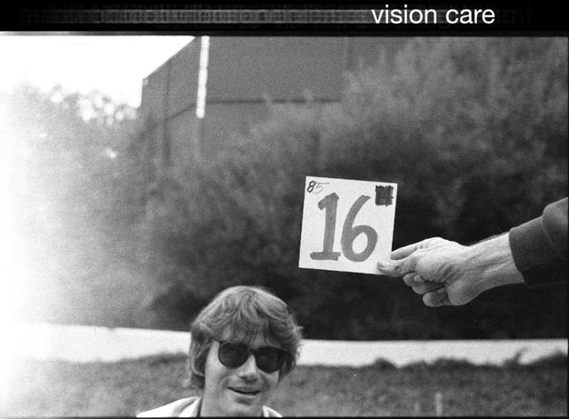
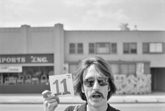
Vision Care
Over the past several years, computer algorithms that can transform images into quantitative, machine-readable data have opened new possibilities for data visualization. For the Ruscha project, Getty used Google’s Cloud Vision application programming interface (API) to generate text-based tags describing what is in the images. Palm tree is one example; another is vision care. While the computer is decent at recognizing palm trees, it was less effective at understanding what was in the images tagged vision care, as they clearly do not illustrate the term in any real sense (there are no ophthalmologist offices or eyeglass retailers depicted) (fig. 4.3). Rather than dismiss this as a mistake or accident, we can consider what this tag does show.
When the team stopped driving periodically to load new reels onto the camera mounted in the back of the pickup truck, they marked the beginnings and ends of the reels using cards depicting the reel number. It is these images that computer vision labeled vision care.4 It is unclear why the computer associated these images with vision care, but it probably has something to do with the presence of sunglasses and possibly the numbered card, which is evocative of an eye chart. These images end up revealing a different type of information: the locations along each street where the crew stopped to change film rolls. The vision care tag becomes a possible proxy for the length of a reel. Moreover, in its attempt to describe the image, the computer generates the kinds of word-image associations that Ruscha himself is so famous for. A face with sunglasses generates tags including snapshot, facial expression, and stock photography along with vision care (fig. 4.4). Thus, sending an archive of photographs through a computer-vision tagging algorithm can generate thousands of unique text-image associations, some of which, like vision care, are technically inaccurate but revelatory. The generation of data from photographs is a process that, like Ruscha’s work, asks us to question the text, the image, and the relationship between them.
By turning machine-readable information into images, data visualization asks us to consider how data relates to the thing it represents. When it doesn’t, our attention is drawn to the underlying processes of data generation by which qualitative information is transformed into elements of data, including tags like vision care as well as location information. As the SoLA Archive illustrates, this process of “datafication” is not always neat or simple; it can contain errors, glitches, unexpected juxtapositions, gaps, and surprises. Such idiosyncrasies should not be dismissed as signs of a broken system; rather, they should be seen as providing specific and targeted opportunities for us to see, and thus to critique and question that system.
The The
In addition to tagging, Getty used optical character recognition (OCR) to translate images of text into machine-readable text. As a result, it is now very easy to, for example, identify every image that contains the word the in “12 Sunsets” (such a search returns 1,523 images). You can view all of them or look at individual years. For example, there are 112 images that include the in the 1966 shoot, and 27 in 1995. The query was initially proposed by one of the research project’s scholars, Eva Ehninger, who was interested in a particular image from Ruscha’s 1966 book Every Building on the Sunset Strip, taken during the shoot that same year (see fig. 12.1).5 On the long, white wall of a building, there is a single word: The. Questions arose: Was this image retouched in the book to show only The and no other words? Was this an intentional erasure by Ruscha to highlight the humble, direct article the? When we look at the individual photographs in the archive that make up the montage, it becomes clear that Ruscha used the photo as it was taken (fig. 4.5). So, what was happening here? Jumping forward to the next shoot, in 1973, the same wall is now a little different (fig. 4.6). We can see the full title of the business, The Classic Cat, a famous nightclub on Sunset Boulevard. The “Classic Cat” part of the sign was added between the 1966 and 1973 shoots. It appears that the 1966 shoot took place on one of the days the sign was being installed. By 1976, ivy had grown over the letters, to the point that OCR could no longer find the word The (see fig. 12.7).
This example demonstrates a key characteristic of both Ruscha’s archive and data visualization: how specific data points from a SoLA Archive reel relate to the dataset overall. Central to Ruscha’s project was the compilation of thousands and thousands of images; similarly, data visualization relies on lots and lots of data. While the whole is critically important in each case, the part is also incredibly relevant. Regarding the word the, images with the word by itself make clear that the 1966 photo shoot happened at a very specific time in the history of The Classic Cat building on Sunset Boulevard. Data visualization can provide insight into a mass of information by abstracting it and extrapolating the general from the whole, but in this example, extracting only the 1966 photo would obscure the aberration of the lone the. At the same time, because the image was processed using OCR, the existence of a searchable data point—the the tag—means that the trace of the appearance and then disappearance of a word is nonetheless recoverable.
The story of the the suggests another kind of visualization possibility: a map of urban change over time based on tags. In our data visualizations for this publication, for example, we used the tags tree and the to explore trends in urban development along Sunset Boulevard (see “Description as Data,” this volume).
DONT
As the examples of vision care and the demonstrate, gaps or inconsistencies in a dataset can often lead to insights or new questions. At other times, the consistency of the data across the archive leads to insights. For example, there are 426 images for which the OCR process captured DONT (as in don’t). Of these 426 images, DONT appears more often on the east side of Sunset than on the west side, which you can observe because each image is geotagged with its location. Don’t seems a curious word to be so widespread; ads and signs with words on them typically want you to do or buy something, not discourage you from it (fig. 4.7). Looking more closely, you find that almost all of them contain a pedestrian crossing and a streetlight. Zooming in a bit further reveals something else: “DONT WALK” signs (fig. 4.8). This, of course, makes sense. If Ruscha’s team had photographed a lit “WALK” sign while driving past, they would have been running a red light. Thus, all the crosswalks that Ruscha’s team drove through were lit with “DONT,” and by mapping the word DONT, you get a map of all the crosswalks too.
Ruscha’s team, aided by Getty, has mapped all the crosswalks with stop lights on Sunset Boulevard without explicitly setting out to do so. This is the serendipitous outcome of keeping the cameras rolling. It makes possible visualizations that may not have been sought out or anticipated. Furthermore, it prompts the question: What else from this dataset could be mapped, or, better yet, inferred? Vacancy rates using real estate–agent signs hanging in empty storefronts? Pharmacies across time? Strip clubs versus country clubs?
These three examples, along with those in the data visualization section, illustrate some of the possibilities for exploration and visualization that the SoLA Archive, in its format as data, affords. Certainly, there is much that one can research or know about the archive or about Los Angeles more broadly from visualizing data elements like tags, OCR text, or location information. However, there are also moments when data elements express something inaccurate, unexpected, absurd, or even uncanny. Indeed, delight is an important part of exploring archives with data visualizations, and in the case of Ruscha’s archive, it seems entirely fitting, and perhaps no accident, that its dataset suggests approaches to mapping that befit the artist’s particular sense of humor.
Notes
-
See Beth Ann Guynn, David Newbury, and Lily Pregill, “Archiving the Archive: Processing the Streets of Los Angeles Photographs,” this volume. ↩︎
-
“12 Sunsets: Exploring Ed Ruscha’s Archive,” Getty, https://12sunsets.getty.edu. Always intended to be a limited-term application, the website for “12 Sunsets” will not be maintained. A video capturing some of its capabilities can be found here: https://vimeo.com/946364401/ba0b654c0d. ↩︎
-
Tim Arango, “‘Turn Off the Sunshine’: Why Shade Is a Mark of Privilege in Los Angeles,” Los Angeles Times, 1 December 2019, https://www.nytimes.com/2019/12/01/us/los-angeles-shade-climate-change.html. ↩︎
-
For more on the use of reels in the project, see Zanna Gilbert and Jennifer Quick, “Ed Ruscha’s Streets of Los Angeles: A Narrative History,” this volume. ↩︎
-
See Eva Ehninger, “Nightmare of Information: Ed Ruscha’s Image Critique,” this volume. ↩︎