Ed Ruscha’s roots in 1950s and ’60s commercial design have earned him equal amounts of praise and derision. It was Ruscha’s deployment of midcentury design’s tools, methods, and images that initially helped to secure his place in the pop art movement in the early moments of his career. Yet many critics came to see Ruscha’s art as banal and unserious, either because of his status as a Los Angeles artist, as Alexandra Schwartz has argued, or because of his associations with the commercial rather than the fine arts.1 At Chouinard Art Institute, where Ruscha studied advertising design, professor of painting Emerson Woelffer declared that in his fine arts classes, Ruscha did nothing but simply import design techniques and tools into his work. Speaking of Ruscha’s art assignments Woelffer declared, “He had to do it [art] on the illustration board . . . he drew the illustration.”2 For Woelffer, design’s methods and techniques had no place in the world of fine art—a sphere in which painting still reigned as the supreme medium. It was precisely at this moment, however, in movements such as pop art, that the lines between art and design were becoming murkier, as artists such as Ruscha moved fluidly between design-based training and careers and identities as professional artists. As I argue in my book Back to the Drawing Board: Ed Ruscha, Art and Design in the 1960s (2022), Ruscha’s relationship to design is one of productive ambivalence, in that he both embraced and subverted its tenets.3 One of the ways Ruscha repurposed design, and pushed it to its limits, was to create works that appeared minimally designed, as if there was little or even no governing aesthetic program. Similar to what Benjamin Buchloh referred to as an “aesthetic of administration” in Ruscha’s books, the idea of “no design” also equates closely to what the artist himself called “no style,” or a “severe” look.4 By understanding how the ideas of “the aesthetic of administration,” “no style,” or visual severity relate to the world of midcentury design, we can locate Ruscha’s art more precisely in its economic and social contexts. In this essay, I focus on his books: the minimal covers, sparse captioning, and black-and-white photographs of unremarkable landmarks embody the notion of “no design” most clearly. While Ruscha cultivated this aesthetic in books, the Streets of Los Angeles (SoLA) Archive has also showed us the flip side of this coin: behind the books exists an expansive collection of images almost absurd in its scope which, in the end, proved to exceed and overwhelm the capacities of printed design.
Los Angeles and Modern Design
From the moment he arrived in Los Angeles, Ruscha became immersed in the city’s bustling design economy. By the 1950s, the Los Angeles area boasted excellent art and design schools, including Chouinard, Otis Art Institute, Scripps College, and the Art Center School. Many of the faculty at these institutions participated in federal arts programs established by President Franklin D. Roosevelt in the 1930s.5 At Scripps, for example, the California architect and painter Millard Sheets developed a curriculum designed to prepare students for careers in the commercial arts and design. (Sheets also served as director of the Federal Art Project in Southern California).6 Art and design students had a choice of many different careers in growing industries such as aerospace, film, and fashion. L.A. art schools trained students to become producers in these industries, and they often had direct connections with specific firms or companies that would hire their students. Chouinard, for example, had since the 1940s been a training ground for Walt Disney’s animators. Eventually, when the school began to experience financial troubles in the 1950s and 1960s, Disney stepped in as an official supporter and guided the school to a merger with the Los Angeles Conservatory of Music in 1961 (though his company had long contributed to scholarships at Chouinard).7
Advertising design was thriving in the 1950s, partially due to the growth of the European immigrant community in Southern California. As artists and designers worked with and transformed modernism’s legacies, architecture, graphic design, and automobile design flourished. For many artists and designers, L.A. offered an environment less bound to tradition and more open to experimental ideas.8 Saul Bass, Louis Danziger, Charles and Ray Eames, and Elaine and Alvin Lustig were among the designers who became known for their experimental work in print design.
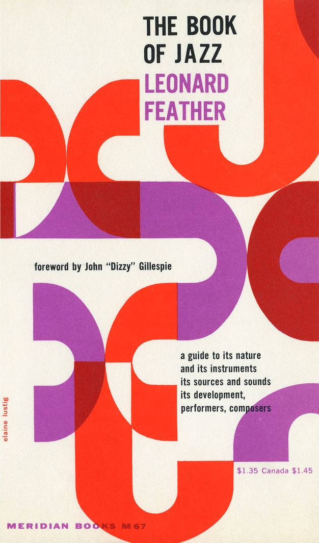
The Lustigs, who had each studied at Southern California institutions (Elaine at the University of Southern California and Alvin at the ArtCenter School in Pasadena), became known in the 1950s for their innovative book designs and album covers (the two had married in 1948). They also took on commissions for business documents such as letterheads and business cards. Fascinated by surrealism and the Bauhaus, especially the work of the designer Jan Tschichold, the Lustigs sought to create a modern design language for print publications, such as the Meridian Books series published by Noonday Press. Between 1955 and 1961, the Lustigs designed twenty-six covers for the press, including the cover for Leonard Feather’s The Book of Jazz (fig. 5.1). With intersecting purple and crimson J shapes and alternating areas of negative space, the cover embodies the dynamic structure of jazz music. Elaine later reflected that when they first began working on this series, “there were few quality paperbacks. He [Alvin] saw it as a series that could be seen together. In fact, we used to go around to bookstores and line them up.”9 At the time, Alvin, as she remembered, was interested in nineteenth-century typography. Their work stands as an example of the type of print design that Ruscha would have become well acquainted with at Chouinard, especially given the Lustigs’ notoriety in the Los Angeles area (while they never taught at Chouinard, Alvin was an instructor at other local arts institutions, including ArtCenter, where Danziger would take his classes).
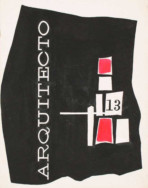
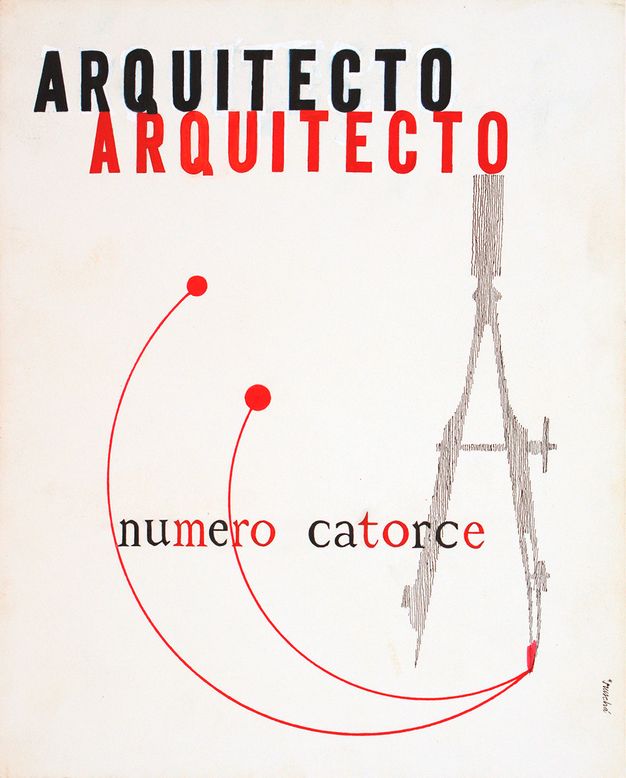
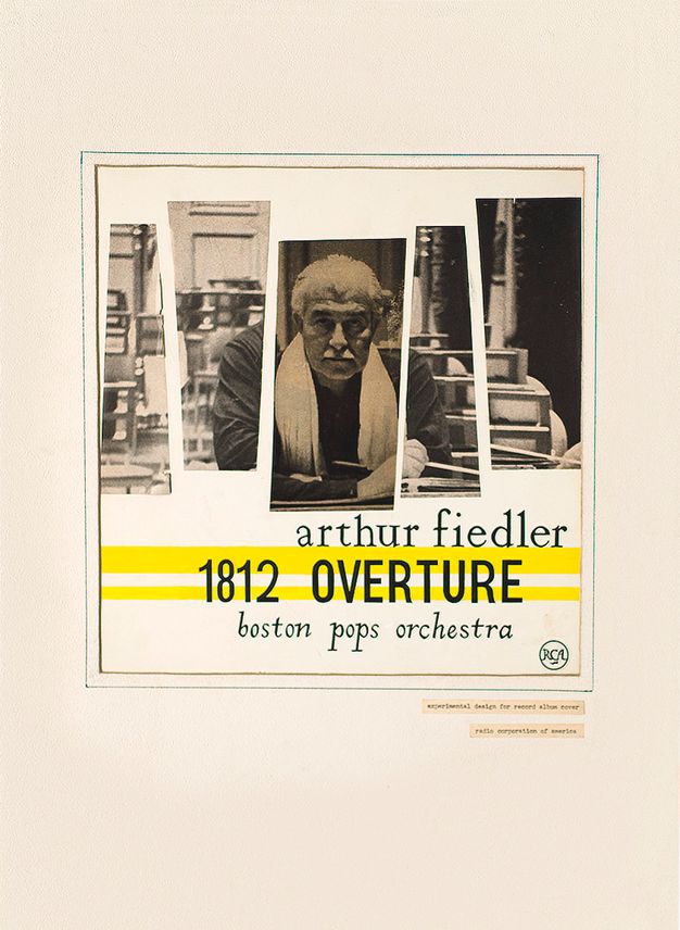
Ruscha’s plans in 1956 for an unrealized magazine called Arquitecto demonstrates the degree to which he had internalized the lessons of that decade’s modernist print design (figs. 5.2, 5.3). He had become acquainted with Mexican modernist design through the architecture-student boyfriend of his sister, Shelby, who was living in Mexico City.10 For a class assignment, he drafted two different covers for Arquitecto. In one design, the magazine’s letters are etched out in white on a black background, with the q in Arquitecto curling like a whimsical tail. To the right, a stack of irregular shapes, two of which are roughly filled in with red, is piled into a rough pyramid. One of the shapes, containing the number 13, resembles a sideways flag. For the other cover design, Ruscha featured a compass rendered in patchy gray. The sharp, pencil-drawn point connects to a red line that splits into two arcs capped by circles at one end. The title, in black and red sans serif type, is written twice, stacked, and slightly staggered, with “numero catorce” in alternating red and black serif letters. Ruscha’s use of bold contrasts, repetition, different typographies, and geometric shapes shows he had learned the lessons of modernist design well. In other student-era assignments, Ruscha began to incorporate photography into his designs, as seen in his record cover for a Boston Pops performance of Pyotr Ilyich Tchaikovsky’s 1812 Overture (fig. 5.4). Ruscha divided photographic images into five shapes, leaving slices of white space between each photograph. By staggering images across the page, he created a rhythmic composition that adds a sense of dynamism to the staid black-and-white headshot of the conductor Arthur Fielder. In this context, geometricized photo pieces contribute to the overall concept of the poster, which communicates a sense of dynamism evocative of the Pops’ lively music.
Ruscha’s Books and Contemporary Design
Ruscha brought this toolbox of modernist ideas and concepts to bear on his artistic practice, even though, as he made clear in the early 1960s, he wanted to leave the world of professional design to pursue a fine art career. He spent six months as a layout artist at the Carson/Roberts advertising agency before leaving in 1961 (the same year that he took a trip to Europe with his brother, Paul, and mother, Dorothy). During those months working at Carson/Roberts, Ruscha realized that he no longer wanted to be in advertising because there was “no substance” to it, and that he disliked having to work collaboratively on client-driven projects.11 Perhaps making his own books appealed to Ruscha at least partly because he could marshal L.A.’s thriving collaborative design culture for his own projects while casting aside or subverting other aspects of design and design culture.
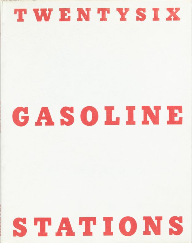
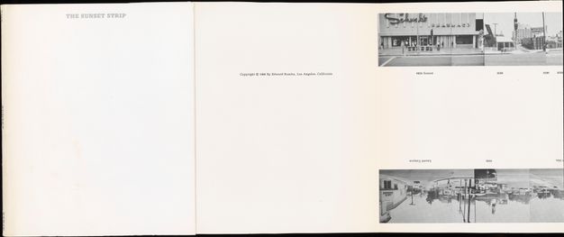
Print design offered a natural sphere of experimentation for Ruscha. As he began his bookmaking in the early 1960s, Ruscha developed a visual formula: white covers with titles printed in serif typefaces.12 Tapping into the networks he was familiar with already, he worked with local typographers, including Vernon Simpson Typographers, on Melrose Avenue, and Anderson, Ritchie & Simon, on Riverside Drive.13 Usually he chose black ink for the letters, but in the case of Twentysix Gasoline Stations, his first published photobook, he chose a red ink that recalls the color scheme used in the Arquitecto covers (fig. 5.5). Subsequently, he would use gray or black inks for his cover designs. Gone from the book covers, however, are the geometric shapes and renderings of drawing tools; only the words remain. For Various Small Fires and Milk (1964) and Some Los Angeles Apartments (1965), Ruscha scaled up the words “Various” and “Some,” suggesting that the publications contain a rather casually selected handful of photos, ostensibly from a larger group of images. The cover for Every Building is even more sparse, with “The Sunset Strip” printed in gray serif type on the front of the book (though the shiny silver slipcase exudes a kind of cheap glamour) (fig. 5.6).14 For the title page, Ruscha also used graduated scaling, increasing the size of the words from top to bottom. There are no visuals on the book covers to signal the content. Only the words indicate what is inside.
Ruscha acquired a deep understanding of print design and typography from his Chouinard classes and his jobs—including his work with the printer Saul Marks at Plantin Press—which he used to design books that bucked standards for engaging, innovative design and contemporary trends in the field. While designers such Alvin Lustig and Saul Bass employed graphic eloquence and bold forms to communicate a publication’s content, Ruscha’s minimal covers and straightforward titles reveal exactly what is inside the books without any flourish or fanfare. Compared to Ruscha’s Arquitecto designs, these photobook covers have stripped-down designs—one could even venture to call them boring. Ruscha has verbally reinforced this idea of his books as unaesthetic objects by declaring that he put them together without a “strategy or game plan.”15 It is precisely this purported lack of design, however, that becomes the design of the books. As David Platzker has observed, Ruscha’s choice of the typeface Beton, a slab-serif typeface, for his 1960s books “could be connoted as a wink to making his book look like a bulletin with the full weight of government authority behind it,” given that another almost identical typeface (Stymie Extra Bold) was used by the United States Government Printing Office on the covers of many publications in the 1950s and 1960s.16 A focus on “utilitarian” typography, as Ruth Blacksell has noted, became important in the conceptual art practices that would emerge around the time Every Building on the Sunset Strip was published.17 Moreover, the idea of a stripped-down “aesthetic of information” (similar to Buchloh’s “aesthetic of administration”) has often been cited as a characteristic of conceptual art practices.18
Moving away from the formal plentitude of modernism, Ruscha established a design approach that, in its bareness, pretends to have no design at all. In contrast to the trend of the modernist book cover, in which text and image were part of a tightly conceived visual program, Ruscha’s covers are bluntly banal, almost absurdly legible. As Andrew Perchuk notes in this volume, Ruscha had also encountered ideas about legibility in design via Gestalt theories his instructors taught him at Chouinard.19 In the context of advertising, a “good” Gestalt was immediately perceptible both visually and conceptually. Ruscha’s books take that idea to its logical conclusion: they are very legible, almost ironically so, as if to push the idea of immediate perceptibility as far as possible. In Every Building, for example, he presented a whittled-down selection from his continually expanding collection of photographs in a way that subverts, through humor and reduction, the tenets of modernist-influenced print design (see fig. 5.6).
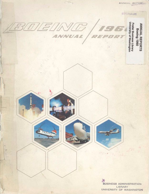
Ruscha’s books became the opposite of an important trend in contemporary design: the dressed-up corporate report or business document. In a 1953 assessment of printing on the West Coast, the artist Eugene M. Ettenberg wrote that “experimental designers in the West have won over such adherents of traditional conservatism as the producers of insurance policies and annual reports of utilities and aircraft companies.”20 He described these fields of design as having traditionally been “frozen” into “set typographic patterns.” On the West Coast, designers were less bound to predetermined templates, leaving more room for design interventions in even the blandest business documents. This was the case with Advertising Designers, a firm founded by Lou Frimkess and Edd Smith in 1950; Ken Parkhurst, who had previously worked with Lustig, later joined the company. While Advertising Designers took on a variety of projects, it became best known for its approach to corporate annual reports. As Danziger put it, “Prior to Ken [Parkhurst], almost all annual reports were designed by in-house printers, and were pretty dry, traditional, and boring.”21 Parkhurst and his colleagues at Advertising Designers made annual reports a collaborative design production involving designers, writers, accountants, and printers. While the designer, or designers, for the 1960 Boeing corporate annual report are unknown, the report presents a good example of the ways designers jazzed up business documents (fig. 5.7). The designers opted for clean, hexagonal shapes (a prime example of a “good” Gestalt), which acted as containers for photographs of Boeing aircraft. The use of geometry and photographs frames a publication full of numbers and data as directly tied to the company’s innovative, modern designs.
Ruscha would have been familiar with these trends from his education at Chouinard. Frimkess and Smith, and many other practicing designers, taught courses at the school. Whereas Advertising Designers presented dull business documents in an aesthetically appealing fashion, Ruscha presented places (often potentially interesting ones, such as Sunset Boulevard) as a compressed strip of black-and-white photos at a scale that lends itself to scanning rather than absorptive attention. Picturing a long run of boulevard in a scaled-down photo strip, Ruscha reduced an expansive urban landscape—a place that would soon become a notorious hub of late 1960s and early 1970s counterculture—into a single accordion-fold page.22 Ruscha’s reflections on the Strip note the changes that took place in the 1960s: “I liked the plastic glamour of the place. . . . But suddenly there was this changeover to the hippie thing. What I remember most is that you could stand anywhere on the Sunset Strip and see cars going down very slowly, always with someone in the backseat tapping on a tambourine—going tap, tap, tap.”23 His photographs—taken during quieter moments when fewer people were out and about—transform the busy, mid-1960s Strip into a compressed, grayscale picture. Color technology, though available in the 1960s, was not in wide use, but even after the invention of new color technologies, Ruscha continued to use black-and-white film to photograph the boulevard through 1998. Spliced together by hand and smoothed with the offset printing process, the image strip in Every Building enhances his idea of “plastic glamour” by drawing attention to the surfaces of buildings as well as the signs, storefronts, and billboards.24 Ruscha’s books were designed to be eminently readable, so much so that they might bewilder someone reading for a deeper or more sophisticated meaning. As Platzker noted in a lecture, Ruscha’s unassuming style meant that both text and graphics “could be rapidly absorbed—or read—by viewers.”25 Platzker quoted Ruscha to point out the artist’s focus on audience reaction: “If I [Ruscha] showed it to somebody who worked in a gas station, they’d say ‘Ah, great,’ but if you showed it to a poet or intellectual they’d say ‘Are you putting me on?’” Ruscha’s comments suggest that he purposely positioned these books to appear not only as undesigned but also as straightforward and easily understood. They are the inverse of the slickly designed corporate reports produced by firms such as Advertising Designers.26
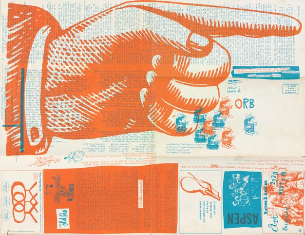
While Ruscha subverted the design trends embodied in corporate annual reports, he capitalized upon other developments in the world of design, such as the growth of collaborative practices. Ruscha’s work on the broadsheet-style journal Orb, published by the student-run Society of Graphic Designers, offers a good example of how students learned to work collaboratively, and how they drew upon local networks and producers (fig. 5.8). Ruscha served as the editor of several issues of Orb, working alongside Jerry McMillan, Patrick Blackwell, and other students. A mashup of student contributions, cartoons, and announcements, the publication is like an index of the different design techniques students were learning in the classroom. These techniques are used in especially playful and creative ways in Orb’s student-designed advertisements, which cited local producers and shops, such as Howard Krebs, Central Typesetting, General Printing Co., Leslie’s Art Supplies, and places that either supported or assisted with the journal or that students patronized. Ruscha’s approach to taking the Sunset Strip photographs (and later the SoLA photographs), and to organizing and distributing them, recalls the workings of a collective such as Advertising Designers as well as the collaborative work of Orb. From the beginning, Ruscha involved McMillan in the photography of Sunset Boulevard. Ruscha’s brother, Paul, began assisting him with the project in the 1970s; later, in the 1990s, Gary Regester joined the endeavor as a photographer; he continues to work on it. Susan Haller helped with the distributional system for the books, including responding to orders from newspaper ads and managing the post office box that received checks for book purchases.
Ruscha’s distributional apparatus is one of the most impressive and important aspects of his bookmaking. Books were purchased via mail order (he took out ads in newspapers), given to artists and collectors, and sold in places such as the Sunset Strip tourism board and the Los Angeles County Museum of Art store.27 Ruscha noted the details of each purchase in his green notebook, in which he also kept track of the number of copies he had left in each edition of the book. Ruscha’s system helped to circulate his books early on, and it also reinforced the idea that these were ordinary books, just one of many printed publications existing in the world. With a carefully cultivated undesigned aesthetic, the books could blend right in with the mountains of printed material produced every day.
From Image Morgue to Obsessive Archive
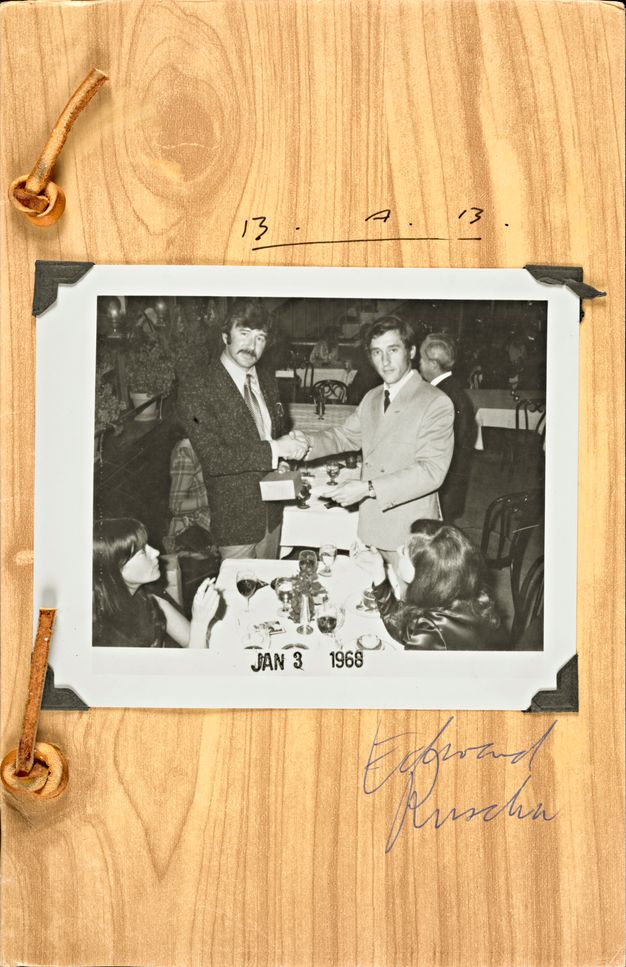
While Ruscha began his photography of Los Angeles–area streets right around the same time that he began making his books, the photographs continued to accumulate even after he moved on to other artistic ventures (many of his most well-known books were made in the 1960s). Later books that expanded on the model seen in Twentysix Gasoline Stations and, to an extent, Every Building on the Sunset Strip, continued to riff on print culture, tools, and the world of professional art and design. In Business Cards (1968), Ruscha and Billy Al Bengston exchange business cards they had designed for each other over a dinner at a local bistro (fig. 5.9). Dressed in suits and solemnly shaking hands, the artists drily poke fun at the professionalization of the artist. In Royal Road Test (1967), Ruscha, Blackwell, and Mason Williams document the aftermath of a Royal typewriter being thrown out the window of a car speeding through the Nevada desert. Here, one of the instruments of the printed page—the machine that literally prints words—is destroyed in a carefully documented, playful-yet-serious performance.
Photographs converge with performance in these books; they are objects made specifically for these publications. The SoLA photographs, however, continued to accumulate well beyond the bounds of the printed container of the book. Though these photographs began adjacent to Ruscha’s publishing work, they turned into, as many commentators in this volume note, a self-generating photographic machine that over time was less of an image morgue and more of an obsessive record of Los Angeles’ changing streetscapes. As Perchuk puts it, this overwhelmingly large collection of images became, at least until its recent excavation via processing and cataloging, an “unmined informational substrate.” In the decision to continue the image morgue’s expansion, Ruscha moved it away from the territory of print design and into a more nebulous space, where the collection’s reason for existence is disconnected from his art. It is almost as if the image morgue has been taken to its logical conclusion; here is a collection so replete with potential that it has become overwhelming in scope. Perhaps this potential can only be mined collaboratively, in a way that has been undertaken by the contributors to this volume. If early on the Sunset Strip photographs were aligned with Ruscha’s publishing, in that they provided a reservoir of images to print in a book, his photographs quickly took on a life of their own, far exceeding the bounds of the world of print-based design that shaped their inception. In this way, the SoLA Archive now aligns with our current experience of the world, one in which there are floods of images that we ourselves create and store on our own digital devices. We can all now act as designers using our own image morgues to document and shape our experience of the world.
Notes
-
Alexandra Schwartz, “‘Second City’: Ed Ruscha and the Reception of Los Angeles Pop,” October 111 (Winter 2005): 23–43. Many critics also levied similar criticisms at other pop artists. For more on early critiques of pop, see Peter Selz et al., “A Symposium on Pop Art,” Arts 37, no. 7 (1963): 35–45. ↩︎
-
Emerson Woelffer, quoted in Paul Karlstrom, “Oral History Interview with Emerson Woelffer, 1999 March 26,” Archives of American Art, Smithsonian Institution, Washington, DC, https://www.aaa.si.edu/collections/interviews/oral-history-interview-emerson-woelffer-11975. Woelffer thought Ruscha’s approach coincided perfectly with the emergence of pop art. For more on Ruscha’s relationship to pop art and his long engagement with design, see my book Back to the Drawing Board: Ed Ruscha, Art and Design in the 1960s (New Haven: Yale University Press, 2022). ↩︎
-
See Andrew Perchuk, “Information Man,” this volume, for an examination of how Ruscha’s work dialogues with information theory and cybernetics. See also Margaret Iversen, “Disruption and Recursion: On Ruscha’s Criticality,” this volume. ↩︎
-
Ruscha has used the term no style frequently. See, for example, Henri Man Barendse, “Ruscha: An Interview,” in Edward Ruscha, Leave Any Information at the Signal: Writings, Interviews, Bits, Pages, ed. Alexandra Schwartz (Cambridge, MA: MIT Press, 2002), 217; originally published in Afterimage 8 (February 1981): 8–10. Ruscha used the word severe in Douglas M. Davis, “From Common Scenes, Mr. Ruscha Evokes Art,” in Ruscha, Leave Any Information, 28; originally published in the National Observer, 28 July 1969, 1. “The aesthetics of administration” is from Benjamin Buchloh, “Conceptual Art 1962–69: From the Aesthetic of Information to the Critique of Institutions,” October 102 (Winter 1990): 105–43. ↩︎
-
Roosevelt’s New Deal art programs served to employ artists and provide Americans broader access to the arts. The Index of American Design, which was established to collect and document American design, is a notable example. For more on the New Deal and the arts, see Anne Prentice Wagner, 1934: A New Deal for Artists (Washington, DC: Smithsonian American Art Museum, 2009). ↩︎
-
Wendy Kaplan, ed., California Design, 1930–1965: Living in a Modern Way, exh. cat. (Los Angeles: Los Angeles County Museum of Art, 2011), 35. ↩︎
-
“Chouinard Art Institute,” California Institute of the Arts, https://calarts.edu/history. ↩︎
-
Wendy Kaplan explores this experimental design culture in her introduction to California Design, 1930–1965, 27–60. ↩︎
-
Patricia Belen and Greg D’Onofrio, “Elaine Lustig Cohen: The Art of Modern Graphics,” Shelf, no. 2 (2012): 96–97, 102–3. ↩︎
-
Susan Haller, emails to the author, 20 June 2022 and 31 October 2022. ↩︎
-
See more about this transition in Ruscha’s career in my book Back to the Drawing Board, 46–49. ↩︎
-
He often used Beton for his book covers. ↩︎
-
Green spiral-bound notebook containing notes written by Ed Ruscha, Paul Ruscha, Susan Haller, Bryan Heath, and Eddie Ruscha, box 7, folder 13, Edward Ruscha Photographs of Sunset Boulevard and Hollywood Boulevard, 1965–2010, 2012.M.1, Getty Research Institute, Los Angeles. ↩︎
-
The silver slipcover recalls Andy Warhol’s Mylar Silver Clouds, also made in 1966. Alyce Mahon’s essay in this volume explores the nature of this reflective cover, which, by dint of showing the viewer’s own reflection, invites a kind of performative engagement with the book as an object. ↩︎
-
Ruscha has mentioned this lack of game plan not infrequently when discussing his books. See Rachel Cooke, “Ed Ruscha: There’s Room for Saying Things in Bright Shiny Colours,” The Guardian, 11 September 2010, https://www.theguardian.com/artanddesign/2010/sep/12/ed-ruscha-obama-pop-art. ↩︎
-
David Platzker, “Old Pine and a Few Signs” (lecture, “The Streets of L.A. & Ruscha’s Practice,” online workshop organized by the Getty Research Institute, 17–19 August 2020). ↩︎
-
Ruth Blacksell discusses utilitarian typography in conceptual art in “From Looking to Reading: Text-Based Conceptual Art and Typographic Discourse,” Design Issues 29 (Spring 2013): 60–81. ↩︎
-
Buchloh, “Conceptual Art 1962–69.” ↩︎
-
See Perchuk, “Information Man.” ↩︎
-
Jeremy Aynsley, “Developing a Language of Vision: Graphic Design in California,” in Kaplan, California Design 1930–1965, 264. ↩︎
-
Louis Danziger, quoted in Louise Sandhaus, Earthquakes, Mudslides, Fires, and Rioits: California Graphic Design 1936–1986 (London: Thames & Hudson, 2014), 76. Danziger said this about Parkhurst in an email correspondence with the author of this book, June 2013. ↩︎
-
Many of the clubs that had thrived in the earlier part of the twentieth century had closed in the 1950s, which made more venues available at a lower cost. The Whisky a Go Go, at 8901 Sunset Boulevard, became L.A.’s first discotheque, with female DJs clad in tall white boots commanding the floor. (They were later called go go dancers). Ciro’s reopened in 1965 as a similar type of venue and became known as a place to see the Byrds, whose album Mr. Tambourine Man was released that same year and was in frequent rotation at the club. Other clubs sprang up on the Strip, including Gazzarri’s, London Fog, and the Trip. As the Strip drew larger and larger crowds, tensions grew between the partyers, city officials, and residents who wanted to develop the area into a financial district. Eventually, city officials put a ten p.m. curfew in place, which led to the infamous curfew riots of November 1966. See also Josh Kun, “Songs for Every Address: The Music of Ed Ruscha’s Photographs,” this volume. ↩︎
-
Ed Ruscha, quoted in David Kamp, “Live at the Whisky,” Vanity Fair, 10 November 2000, https://archive.vanityfair.com/article/2000/11/live-at-the-whisky. ↩︎
-
Hadley Meares, “Rebellion and Rock ‘n’ Roll: The Sunset Strip in the ’60s,” Curbed Los Angeles, 7 March 2019, https://la.curbed.com/2019/3/7/18244871/sunset-strip-whisky-riots-bars. For more on the photographs as capturing and representing information, see Eva Ehninger, “Nightmare of Information: Ed Ruscha’s Image Critique,” this volume. ↩︎
-
Platzker, “Old Pine.” ↩︎
-
Buchloh, “Conceptual Art 1962–69.” ↩︎
-
Ruscha, Green spiral-bound notebook. ↩︎