| Education | ||
| Exhibitions | ||
| Explore Art | ||
| Research and Conservation | ||
| Bookstore | ||
| Games | ||
| About the J. Paul Getty Museum | ||
| Public Programs | ||
| Museum Home
|
March 4–June 22, 2003 at the Getty Center
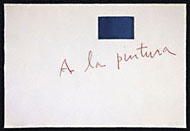
Robert Motherwell's A la pintura (To Painting) is a sumptuous artist's book of aquatint images and letterpress texts, and one of the most important examples of this genre. This exhibition displays all 24 sheets of the book held in the special collections of the Research Library at the Getty Research Institute. Filmmaker Michael Blackwood's interview with Motherwell, filmed at Universal Limited Art Editions at the time of the book's creation in 1972, is also featured in the gallery. |
||||||
The Artist's Book An artist's book is an illustrated publication produced in limited editions. Each image is an original work executed by the artist directly on the support (stone, wood, metal, etc.) from which it is printed. The origins of the genre are debated, but it flourished especially in France and Italy in the early part of the 20th century. Printmaker Tatyana Grosman brought the tradition to the United States, but her emphasis on the partnership between artists and printers was more daring than the European antecedents, and pushed the boundaries of printmaking itself. |
||||||
A New Collaboration Motherwell (1915–1991) was an abstract expressionist painter best known for his decade-long series of paintings titled Elegy to the Spanish Republic. He created A la pintura as his response to Spanish poet Rafael Alberti's verses celebrating painting. It was also a reaction to the repeated pleas by Grosman to join other prominent artists and poets who were collaborating in her Universal Limited Art Editions studios on Long Island. A printmaking renaissance in the United States first blossomed in 1958 in this bucolic setting. |
||||||
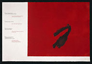
The Spanish Poet Alberti, whom Motherwell considered the greatest living Spanish poet, belonged to the "Generation of '27." This group of poets rose to prominence in the period leading up to the Spanish Civil War—a conflict that had claimed Motherwell's sympathies since his student days. Alberti wrote these poems in the 1940s and dedicated them to his first experience of painting at the Prado, to the palette, to the paintbrush, and to the various qualities of black, blue, red, and white. |
||||||
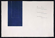
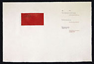
Artist and Artisan The deep color saturations and expressive lines in these prints were achieved over long periods of experimentation, in close partnership with master printer Donn Steward. Motherwell designed the book with as much attention to the placement and color of words (English in black, Spanish in colors) as to images. Thinking in terms of medieval illuminated manuscripts, Motherwell conceived a unique marriage of color, layout, and typography to represent his artistic ideas. |
||||||